Client: Diageo
Project: The Singleton Brand Identity Launch & Limited-Edition Packaging Design
In 2004 we were briefed to develop a new single malt product aimed at the Taiwanese market, with the potential to expand sales into China should it prove successful. The original idea was to adapt the existing Glen Ord branding and use a standard round profile bottle.
However, we quickly established that the brief was too tight to create a new and distinctive product concept. We helped re-define the strategy and write a new brief, calling for a whisky that referred back to a clearer, more simplistic design.
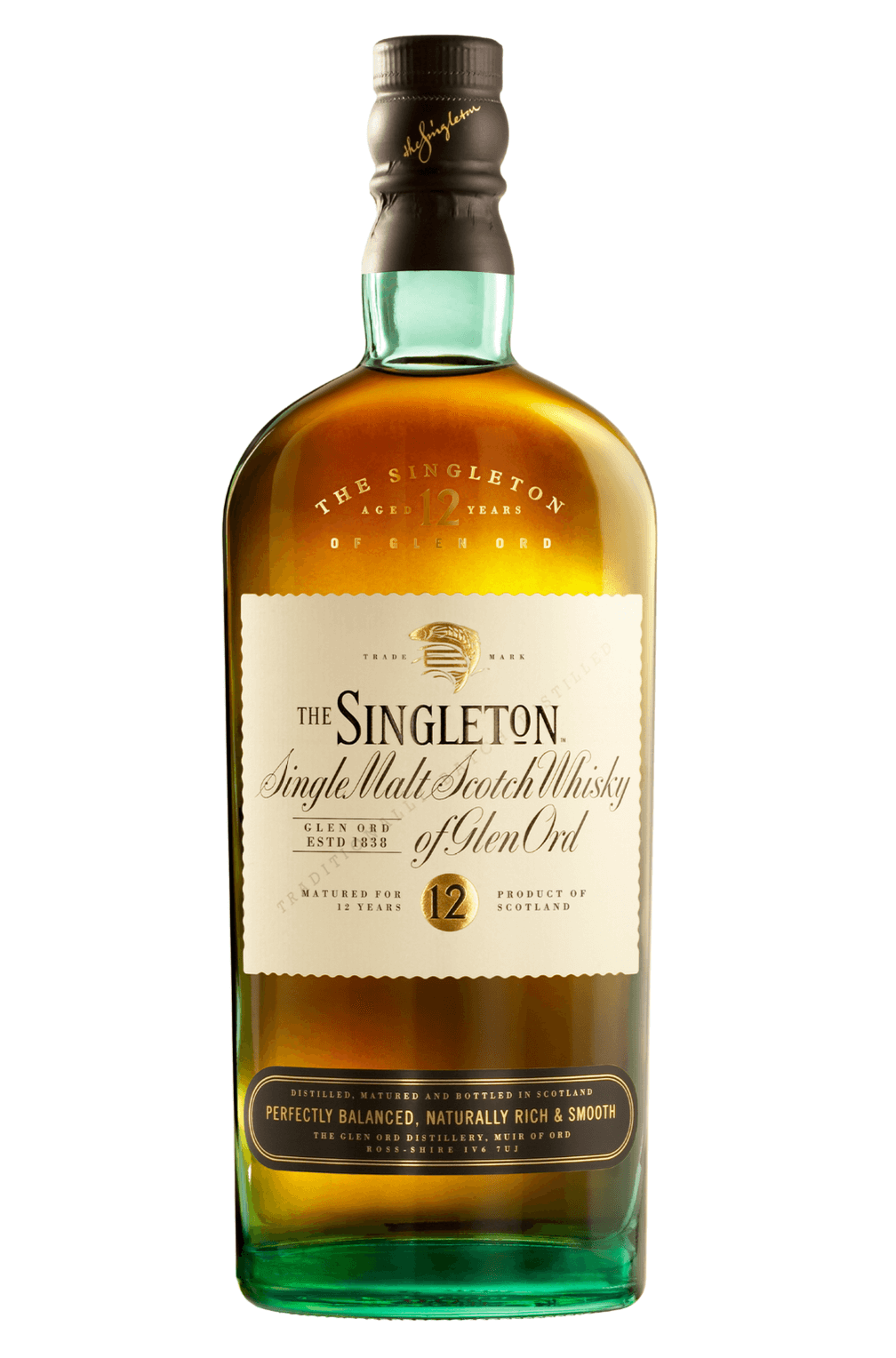
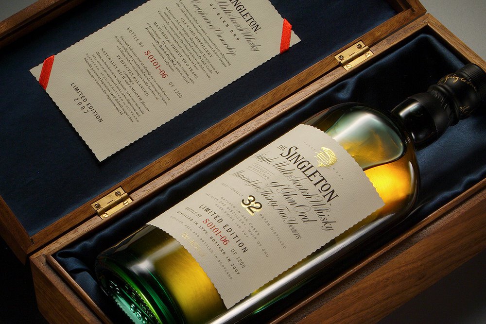
A Scottish salmon, embossed in gold and leaping over a fence, was designed; its auspicious symbolism readily understood in the Far East. On outer packaging, for limited editions like the 32 Year-Old, the salmon tail is abstracted as an extension of the brand language.
The Singleton brand has become one of Diageo’s best-selling single malt whiskies and such has been its success it is now sold worldwide, not just in the Far East.
We started the project by designing a tall, oval bottle shape, to give the new brand greater shelf presence and an ownable asset. The premium status of the product was then highlighted through the introduction of blue coloured glass, while hand-drawn lettering was created specifically for the Glen Ord, Dufftown and Glendullan distillery variant text on the front label.


