Client: CAMUS
Project: Core Range Packaging Redesign
Founded in 1863, CAMUS is the largest family-run, independent Cognac House today. It has been owned and operated by the CAMUS family for five generations. It cultivates a passion for exceptional Cognacs, using a patented, bespoke distillation process whereby the ‘heads’ are extracted and tasted litre by litre, and a small portion of them - highly concentrated in aromas - are reintegrated into the heart of the distillate to produce intensely aromatic Cognacs. This method, unique to CAMUS, creates flavour-rich Cognacs, and has resulted in the House being the most awarded Cognac brand by international juries.
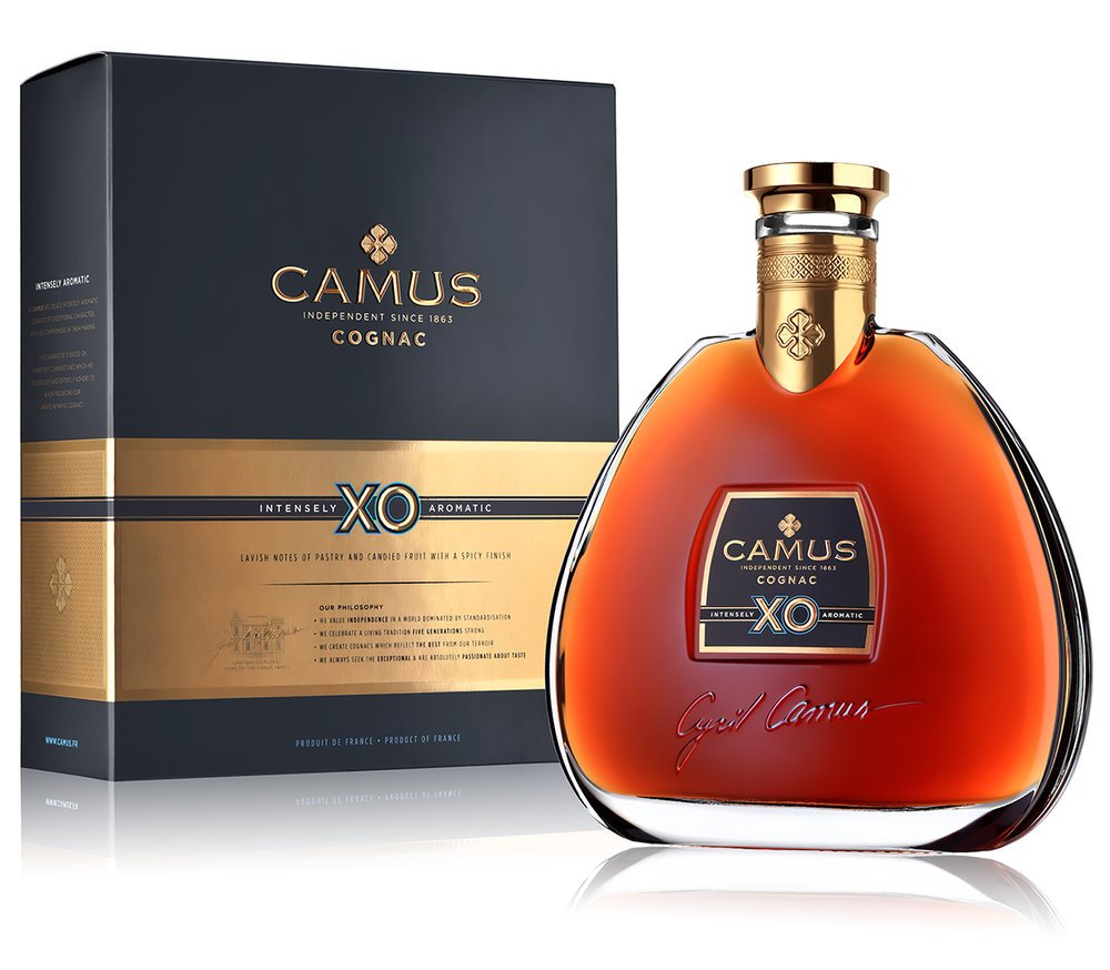
In addition, the origins of CAMUS’ aromatic intensity is revealed by a bold statement on each carton of the three cornerstones of the liquid’s production, namely: wines distilled with the lees, the house’s unique ˝Instensity˝ distillation process and its exclusive ageing in small casks.
The packaging design features an unusual colour scheme in the world of Cognac, evoking the terroir and heritage of the Charente region: petrol grey recalls the flint stones - typically found in the Borderies soil - and lavender blue is a reminder that this is one of the sunniest areas of France. The touches of white and gold bring elegance, modernity and dynamism to the design of the three Cognacs: Very Special, VSOP and XO.
For the last 20 years Cyril Camus, the house’s head, has been refining and perfecting the brand’s different expressions and he turned to us to create a new disruptive design that not just breaks the classic codes of Cognac but is an open statement of his family’s convictions and passion.
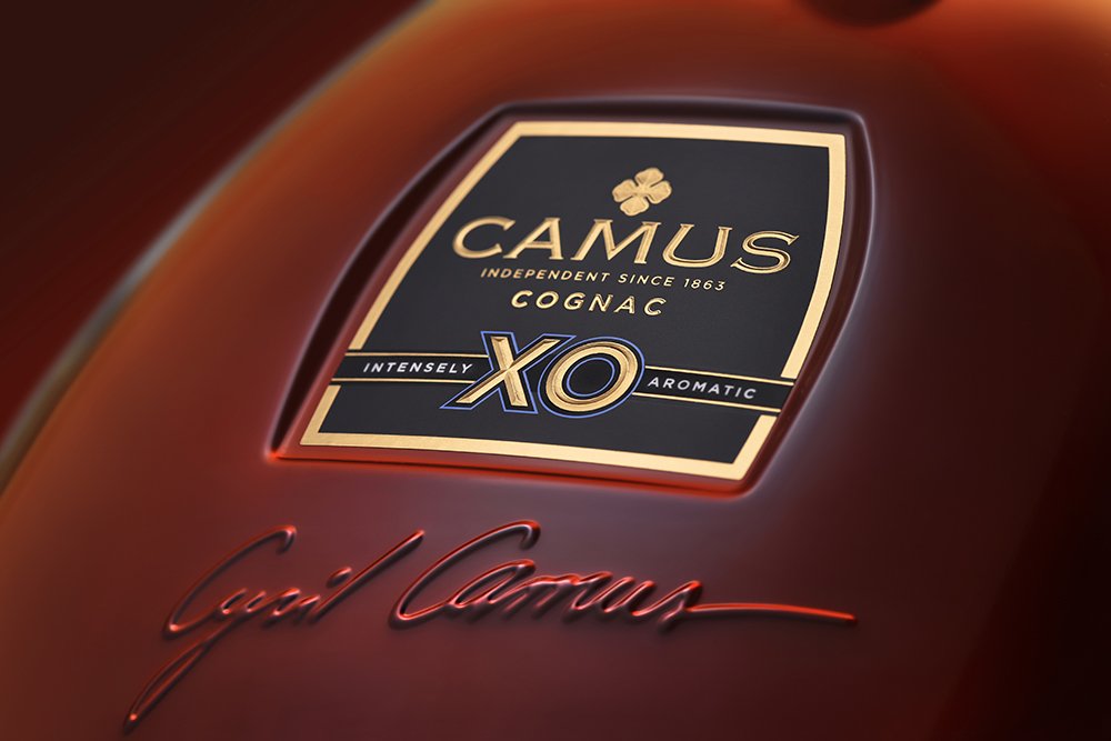
The new packaging presents CAMUS’ philosophy and commitments on the front of the carton and bottle label, accompanied by Cyril Camus’s signature and an illustration of the CAMUS family, the Chateau du Plessis. Tasting notes are given pride of place on the carton front and front labels to guide the consumer on the Cognac’s flavour profile.


