Client: Pernod Ricard India
Project: Royal Stag Packaging Redesign
Royal Stag was launched in 1995; the first whisky in India not to use any artificial flavourings. The brand which is a blend of imported Scotch malts and Indian grain spirits, was acquired by Pernod Ricard in 2001 and has gone on to be Pernod Ricard’s best-selling brand by volume.
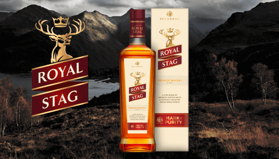
We began the project by designing a new bottle with flatter and straighter shoulders, a more pronounced taper, and a taller rectangular, rather than square, shape. We adorned the bottle’s sides with two embossing details: Seagram Quality and crest and Since 1857.
We then developed the packaging graphics; refining the bottle label shape to match the new shoulder shape, creating a more modern stylised stag’s head, contemporising the wordmarque and its holding ribbon, emphasising the premier status of the whisky, and introducing a new bar with a ‘Mark of Purity’ message. We also refreshed the maroon to give it a brighter and graduated hue.
Our redesign was credited by Pernod Ricard India’s Marketing Director, Kartik Mohindra, as being responsible for a 21% uplift in sales (2021 to 2022) - amounting to an additional 4.7 million nine-litre cases.
Previous Packaging
We originally worked on the brand when it first launched and was owned by Seagram’s but, more recently, we were commissioned to redesign its packaging. We were set four objectives. First to help counter the inroads made by new brands entering Royal Stag’s sector of the whisky market. Secondly, to inject the packaging with more dynamism. Thirdly, to strengthen the brand’s youthful codes and, fourthly, to modernise the brand’s packaging without diluting the equity built up over the years of its valuable visual assets (such as its brandmarque, wordmarque and colour palette of cream and maroon).


