Wit In Packaging
In recent months there have been a number of articles in the design and marketing press about the use by brands of humour in their advertising and social media; articles like Creative Review’s How Aldi Became Britain’s Funniest Supermarket (https://www.creativereview.co.uk/aldi-supermarket-humour-marketing/).
This prompted me to think about humour and wit in other media, most particularly in drinks packaging, given Sedley Place’s specialism in this arena.
In the past I’ve been involved in non-drinks packaging projects where wit has been employed, most notably on a Boots Company project for a product not normally associated with a humorous condition. The design for Boots Wart Remover won plaudits from the client and a Design Week award.
© Lippa Pearce
This earlier work has always stayed with me as a testament to wit’s potential, yet any review of the drinks category’s packaging reveals that it is in short supply. True, wit has many dimensions and doesn’t always cross borders but its power lies in its ability to generate an emotional reaction - such as a smile of pleasure - and to project the personality of a brand.
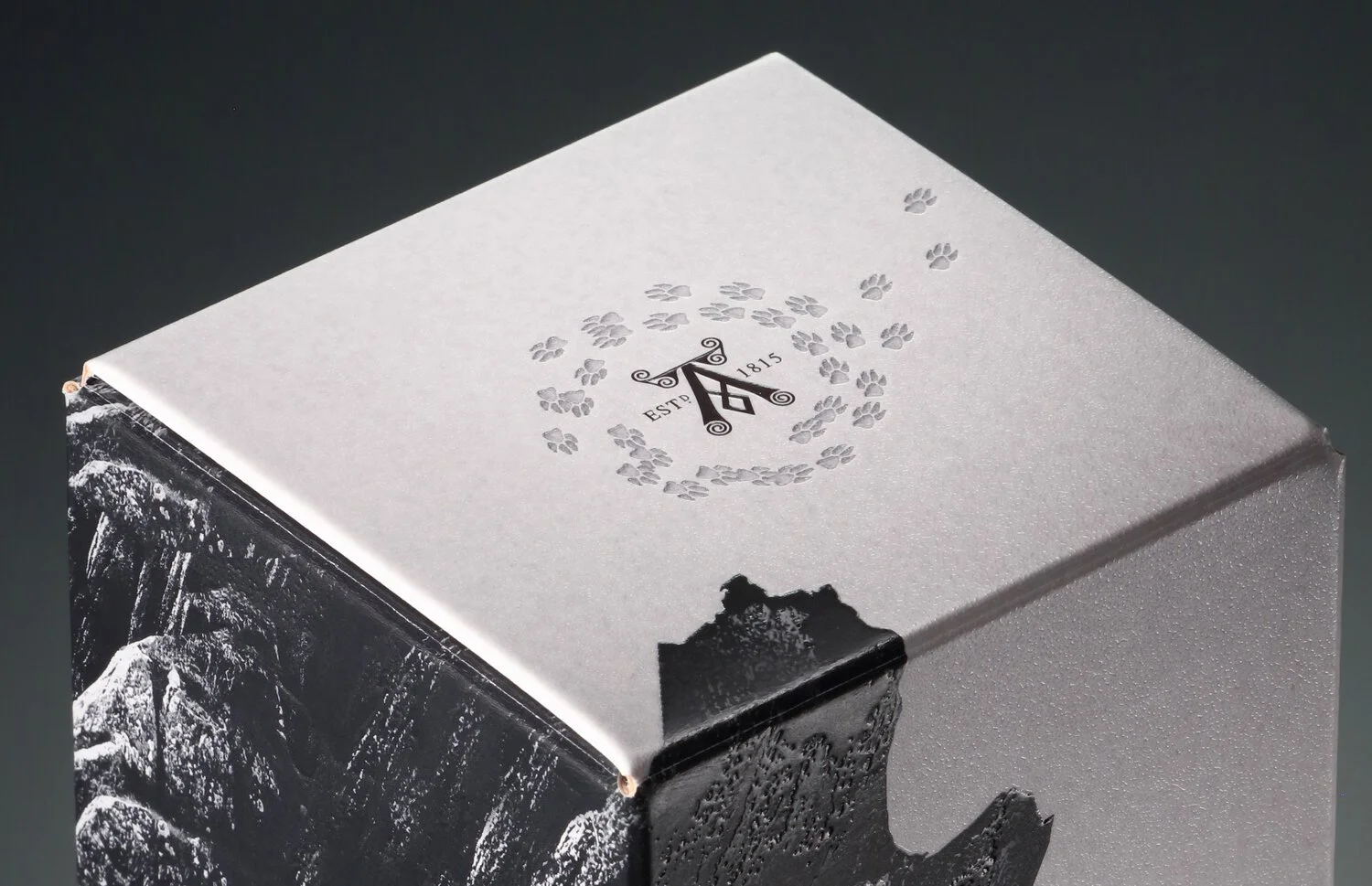
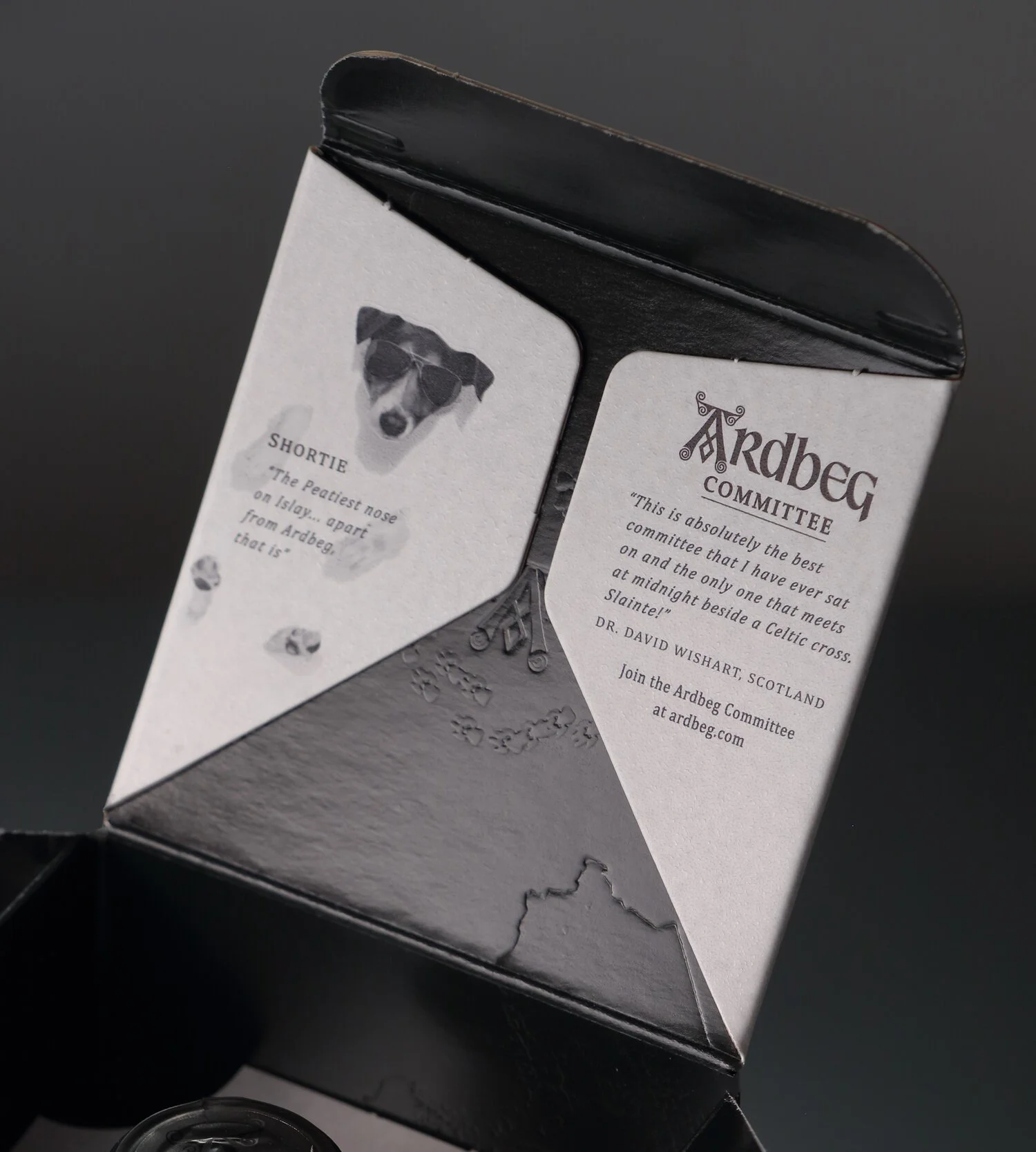
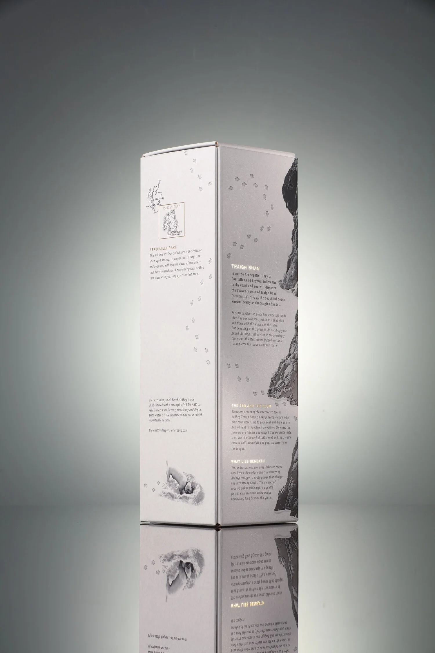
This latter aspect was very much in mind when Sedley Place designed the packaging for Ardbeg’s penultimate addition to its permanent range, its 19-Years Old Ardbeg - called Traigh Bhan after a beach on Islay popularly known by locals as The Singing Sands.
Ardbeg’s DNA includes unorthodox wit, which is very much in evidence in videos like The Tale of the ‘Islay-gator (https://www.youtube.com/watch?v=WguBC9IlRfE ), created by the Edinburgh agency Story, and in some of its packaging iterations. We therefore decided to make wit part of the visual messaging on Traigh Bhan’s packaging. Shortie, the distillery’s famous dog, is shown burrowing into the beach’s sand, sunbathing and leaving his footprints in a trail that ultimately becomes a variation of the brand’s knotwork pattern on the carton top.
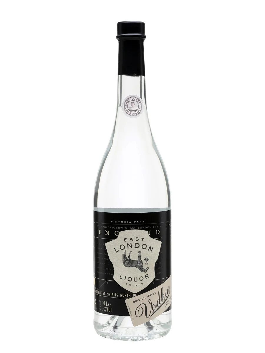
There are other drinks brands, and in turn their agencies, using wit - some with subtlety and some in a more obvious fashion. The East London Liquor Company features an upside-down horse on its vodka’s front label, in acknowledgement of the distillery’s previous role as an East London glue factory.
The Piedmont wine Fazzoletto, which is named after the Italian partisan fighters in World War II who wore red neckerchiefs, shows famous Italian sculptures ‘vandalised’ with a fazzoletto in a humorous manner.
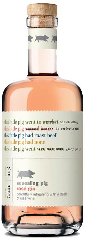
And the Squealing Pig brand subverts the famous nursery rhyme, This little pig…, to communicate product messages in a witty fashion.
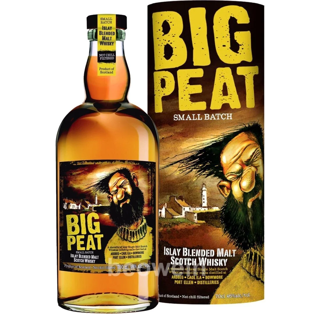
Douglas Laing’s Big Peat is a deliberately less subtle use of wit. The brand uses a humorous caricature to personify the nature of the Islay whiskies blended together. Big, bold and full of flavour, Douglas Laing describes the spirit as “typically Islay in flavour, the palate carries notes of ash, sweet tar, smoking chimneys and a subtle salty beach quality, with a long and lingering phenolic finish” and Big Peat has a nose well-equipped to enjoy every note.
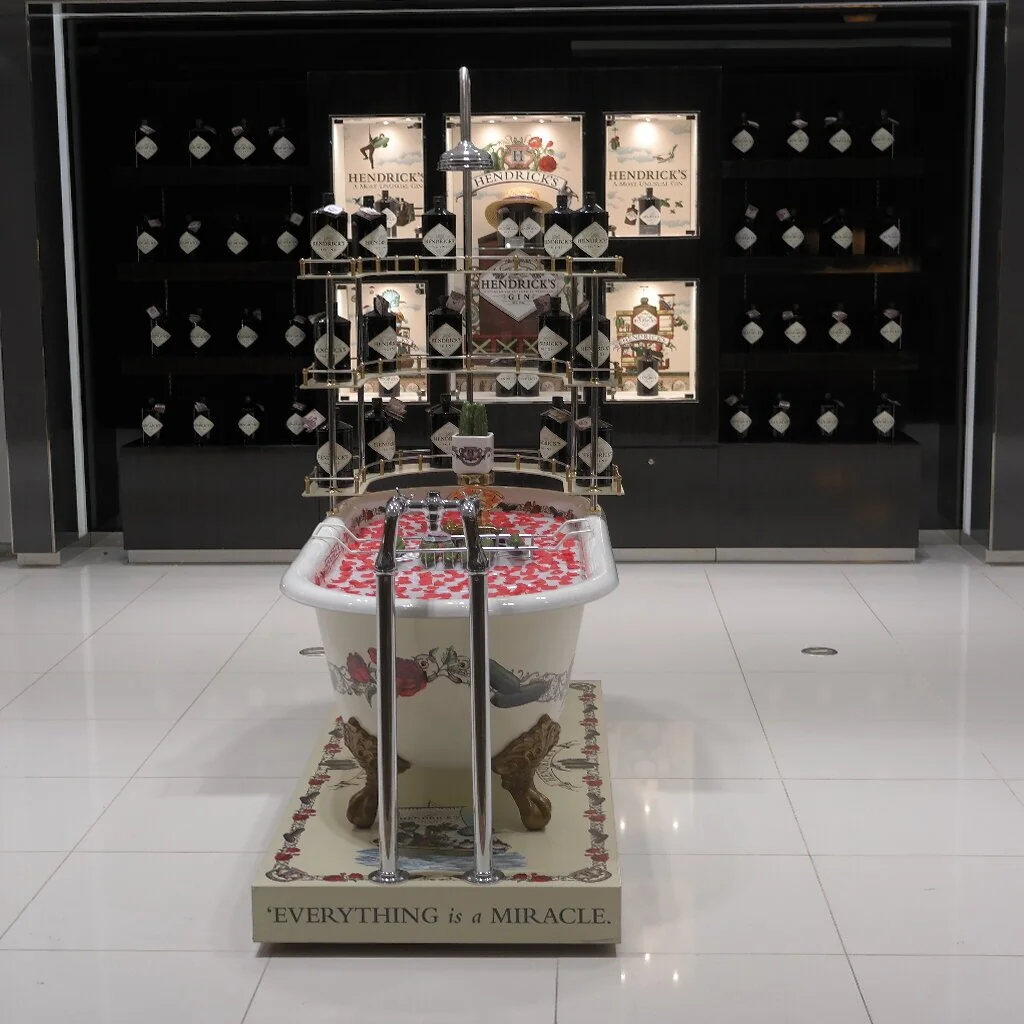
There are numerous instances of brands using humour in other media, which suggests that there is a place for wit in packaging. Hendrick’s Gin is a great example of a brand which uses eccentricity, nonsense, the absurd and humour to promote the brand. I still remember being stopped in my tracks in Dubai Duty Free by the brand’s bathtub display and smiling at the whimsy of it.
Hendrick’s bottle has considerable shelf presence because of its bottle shape and colour and its label shape and is not the right context for humour but the brand’s gift packaging employs eccentricity and absurdity to great effect.
Of course, selling drinks is a serious business, with hard won sales volumes and market share at stake, but wit can play a part in generating a visceral reaction and projecting a brand’s personality - important elements given the competitive nature of individual drinks segments and the challenge to stand out on shelf.


